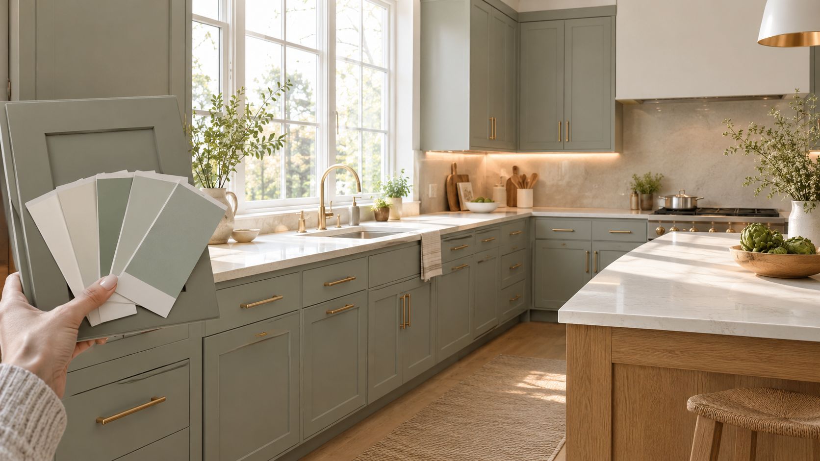
You're standing in a Cherry Hill kitchen where beige oak cabinets, yellowed tile, and polished brass hardware all compete with the daylight from a south-facing window. A sage-tinged sample goes against the backsplash, and the room suddenly looks less dated without becoming stark or overly modern. That reaction is exactly why grey green kitchens continue to attract homeowners who want color, but still need a practical backdrop for everyday life.
The right grey green isn't chosen from a small paint chip in a store. It's specified against your flooring, countertop, window orientation, light bulbs, cabinet material, and finish sheen. The wrong version can look blue, muddy, or almost gray. The right one can soften a 1990s South Jersey kitchen while giving the room enough personality to avoid the anonymous look of all-white cabinetry.
Table of Contents
- Why Grey Green Works in Today's Kitchens
- Understanding Undertones, LRV, and Sheen
- Popular Grey Green Families Compared
- Pairing Grey Green With Materials and Finishes
- Lighting and Layout Strategies That Make the Color Work
- A Cherry Hill Before and After
- Maintenance, Touch-Ups, and Long-Term Performance
- Working With a Mobile Showroom and Next Steps
Why Grey Green Works in Today's Kitchens
Grey green has become the useful middle ground between a neutral kitchen and a strongly colored one. The gray component keeps the room grounded, while the green brings a natural quality that feels more relaxed than crisp white or cool greige. That balance matters in South Jersey homes, where existing oak floors, beige tile, warm trim, and changing daylight often make pure whites look disconnected.
The shift is larger than a single cabinet trend. In the National Kitchen & Bath Association's 2025 Kitchen Trends Report, 76% of respondents named green the leading kitchen color for 2025, while white and gray kitchens were described as off-trend. The same report found that 71% preferred more colorful kitchens overall, with color commonly introduced through cabinets, islands, backsplashes, wallpaper, and wall paint.
My recommendation: Treat grey green as a finish specification, not a paint-name decision.
A homeowner in Voorhees may need a softer, grayer sage because a north-facing room can make blue undertones more visible. A brighter kitchen in Mullica Hill may support a deeper eucalyptus or muted olive because direct daylight gives the color more energy. A south-facing Cherry Hill room with warm bulbs may need a shade with enough gray to prevent the cabinets from turning yellow-green.
Why the palette feels current
Green has returned to kitchen design after years of neutral dominance. A historical review from the NKBA notes that green was already a defining kitchen color in the 1990s, when homeowners embraced everything from hunter green cabinets to sage accents. Current reporting describes the 2020s as a renewed return to green, while 86% of experts in a 2026 outlook expected green to remain a favored kitchen color. A separate summary reported that 96% expected neutrals to remain popular alongside it in the 2026 kitchen color outlook.
That combination explains grey green's staying power. It doesn't reject the calm role of a neutral. It updates it with an earthy color that works with wood, stone, brass, black, and soft ceramic tile.
Homeowners comparing options can also use South Jersey kitchen trend guidance to place grey green within a broader renovation plan. The important next step is sampling specific families under the actual lighting in your home, then choosing the sheen and material pairings that keep the color from becoming cold or dull.
Understanding Undertones, LRV, and Sheen
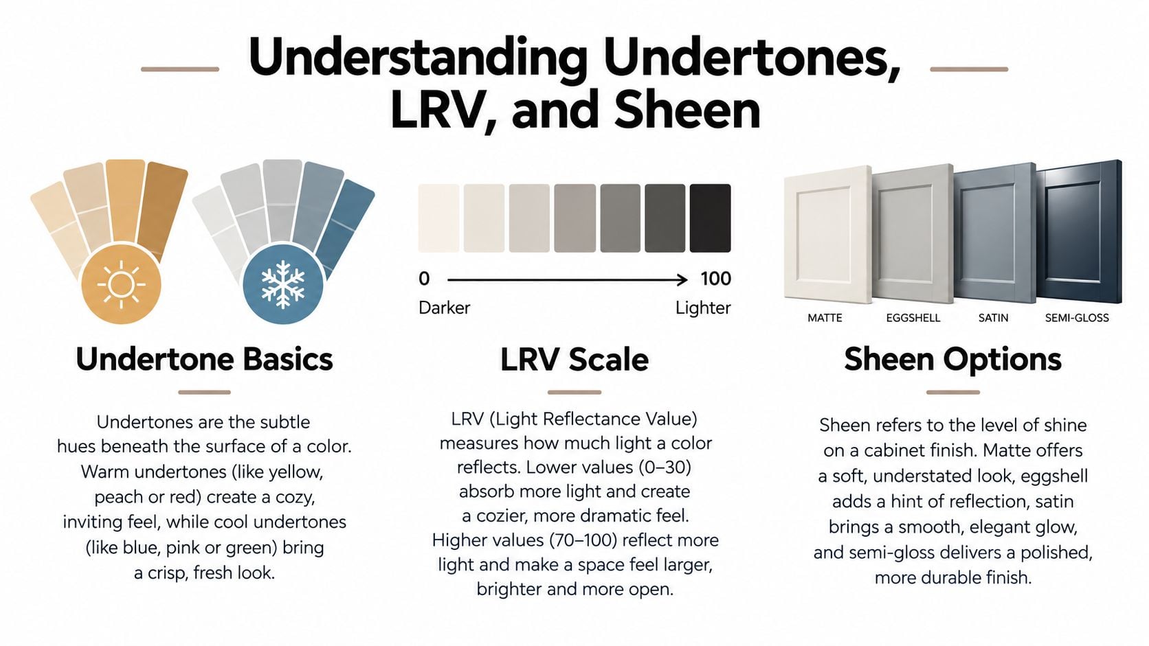
Three technical variables control how grey green will look after installation: undertone, Light Reflectance Value, and sheen. Ignore any one of them and a sample that looked perfect in a showroom may fail beside your floor or countertop.
Undertone is the subtle color beneath the dominant hue. A grey green can contain a warmer yellow base or a cooler blue base. In a north-facing Voorhees kitchen, blue can become more apparent and make the cabinets look cooler. In a bright, sun-filled room, the green may become more pronounced. Surrounding finishes create another shift. Golden oak can make a balanced grey green appear cooler by comparison, while walnut and warm stone can pull it toward a softer olive reading.
Use LRV to judge visual weight
Light Reflectance Value, or LRV, measures how much visible light a surface reflects on a scale from 0 to 100. Higher-LRV colors generally help a small or dim room feel brighter and more open, as explained in this guide to Light Reflectance Value in paint.
You don't need to become a color scientist, but you do need to compare shades by depth. A pale mushroom-grey green will recede and keep a narrow galley feeling open. A deeper eucalyptus will create more visual weight and may be better on an island or a limited cabinet run. A medium sage can work across a larger cabinet area when the room has adequate daylight.
Let the finish tell the truth
Sheen changes perceived color. A lower-sheen eggshell absorbs more light and can make a grey green look darker. Satin reflects more light and generally falls in the 25% to 35% reflection range, which makes it a practical option where cabinetry needs wipeability and everyday durability, according to this comparison of eggshell and satin paint.
Before approving a color, use this checklist:
- Test large samples: Paint boards or cabinet door-sized samples rather than relying on a small card.
- Move the samples: Check them beside the floor, backsplash, countertop, and trim.
- Review changing light: Look in the morning, afternoon, evening, and under the fixtures you'll use.
- Compare undertones: Place a warmer and cooler grey green beside each other so the difference becomes visible.
- Check the sheen: Review the color in the proposed cabinet finish, not only on a flat wall.
- Photograph the result: Take pictures from the room entrance and from the main work zones.
Homeowners who want a broader primer on comparing interior color in a specific regional setting can also review this resource on choosing paint for Colorado homes from I PAINT STUFF. The principle applies in South Jersey too: fixed finishes and natural light should make the decision, not the display card.
Popular Grey Green Families Compared
South Jersey homeowners usually gravitate toward four grey green families, and each solves a different design problem. Sage is the quietest option. Eucalyptus has more depth and presence. Olive adds warmth. Mushroom-tinged green-grey gives the least committed interpretation of the color.
Sage works well when you want the cabinets to feel calm rather than dramatic. Benjamin Moore October Mist and Farrow & Ball Pigeon are useful reference points for the family, though the final appearance will depend on the exact formula, surface, and light. In a north-facing galley, a soft sage can prevent the room from feeling heavy, but test it carefully because cool daylight may emphasize blue.
Eucalyptus is more saturated and architectural. A darker example such as Farrow & Ball Treron can anchor an island in an open-plan great room, particularly when the surrounding space has enough daylight and warm wood to balance it. I prefer deeper eucalyptus as an accent or island color unless the room has strong natural light.
Olive is the warmest family in this comparison. It suits an east-facing breakfast area and pairs naturally with walnut, aged brass, and creamy stone. It can look rich and intentional, but it isn't the safest choice for a room already filled with yellow oak unless the sample has enough gray to control the warmth.
Mushroom-tinged green-grey is for homeowners who want color without a strong green statement. It usually works well on perimeter cabinetry with a darker island, especially when the goal is a quieter, resale-conscious palette. The green cabinet color guide offers another way to compare gray-green choices by light, orientation, surrounding colors, and cabinet visual weight.
Grey Green Family Comparison
| Family | Example Shade | LRV Range | Dominant Undertone | Best Room Condition |
|---|---|---|---|---|
| Sage | Benjamin Moore October Mist or Farrow & Ball Pigeon | Verify the selected sample | Soft gray with a cool or balanced reading | North-facing kitchens and restrained palettes |
| Eucalyptus | Farrow & Ball Treron | Verify the selected sample | Deeper, more saturated green-grey | Well-lit open plans and islands |
| Olive | Muted olive cabinet color | Verify the selected sample | Warm yellow-green | East-facing rooms with walnut or brass |
| Mushroom-tinged green-grey | Muted green-grey or greige-green | Verify the selected sample | Gray or taupe-forward | Perimeter cabinets and low-commitment color plans |
Don't treat these categories as rigid formulas. Two colors from the same family can behave differently because their undertones, depth, and finish aren't identical. Sample the actual product and judge it against the materials already staying in the room.
Pairing Grey Green With Materials and Finishes
Grey green cabinets look successful when the entire kitchen is specified as one composition. Cabinet color, wall paint, countertop, hardware, backsplash, island treatment, and lighting should support the same temperature. Choosing each item independently is how a soft sage kitchen ends up with a cold white counter and disconnected yellow hardware.
For cabinetry, Benjamin Moore October Mist and Sage Wisdom provide useful starting points for a softer lower-cabinet treatment. A deeper eucalyptus such as Farrow & Ball Treron can create contrast on an island or a well-lit cabinet run. These are starting points, not automatic answers. Put the door sample against your actual floor and countertop before you approve the formula.
Build the palette from the fixed finishes
Walls should usually move warmer than the cabinets. Benjamin Moore White Dove, OC-17, is a practical sample to test because it can keep a grey green from looking icy without turning the room cream. For countertops, I prefer honed surfaces with restrained movement, such as Caesarstone Cloudburst Concrete or Cambria Brittannica Warm, over a hard, stark white that may exaggerate the gray in the cabinets.
A charcoal-stained oak island can ground a room that uses lighter sage around the perimeter. In a smaller kitchen, keep the island quieter and let the cabinet color provide the interest. In a large open plan, the island can carry the deeper tone while the perimeter stays lighter.
Hardware should follow the undertone. Unlacquered brass warms sage, while matte black sharpens olive and mushroom-tinged green-grey. Handmade zellige or soft taupe ceramic tile can bridge the cabinet and countertop without creating another competing color.
| Grey Green Family | Cabinet Paint | Countertop | Hardware | Wall Color |
|---|---|---|---|---|
| Sage | October Mist or Sage Wisdom | Warm honed quartz | Unlacquered brass | White Dove |
| Eucalyptus | Treron or a comparable deep green-grey | Softly veined warm quartz | Aged brass or restrained black | Warm off-white |
| Olive | Muted olive sample | Creamy stone or warm honed quartz | Matte black or aged brass | Soft mushroom white |
| Mushroom-tinged green-grey | Gray-forward green-grey | Taupe or concrete-look quartz | Matte black | Warm white or light taupe |
Specify surfaces for daily use
Use a washable eggshell wall finish and a cabinet sheen that balances cleanability with glare. Satin is often the practical choice for areas around a range and sink, while a lower-sheen treatment can work on less frequently touched upper cabinets if the manufacturer supports it. Ask your cabinet finisher for the complete coating specification instead of assuming that a paint color alone determines performance.
Before finalizing, compare countertop and cabinet combinations with the doors, slabs, and tile in the same room. If you're still collecting local material sources, you can browse business listings from Wispra, but make the final decision from physical samples rather than online images.
Lighting and Layout Strategies That Make the Color Work
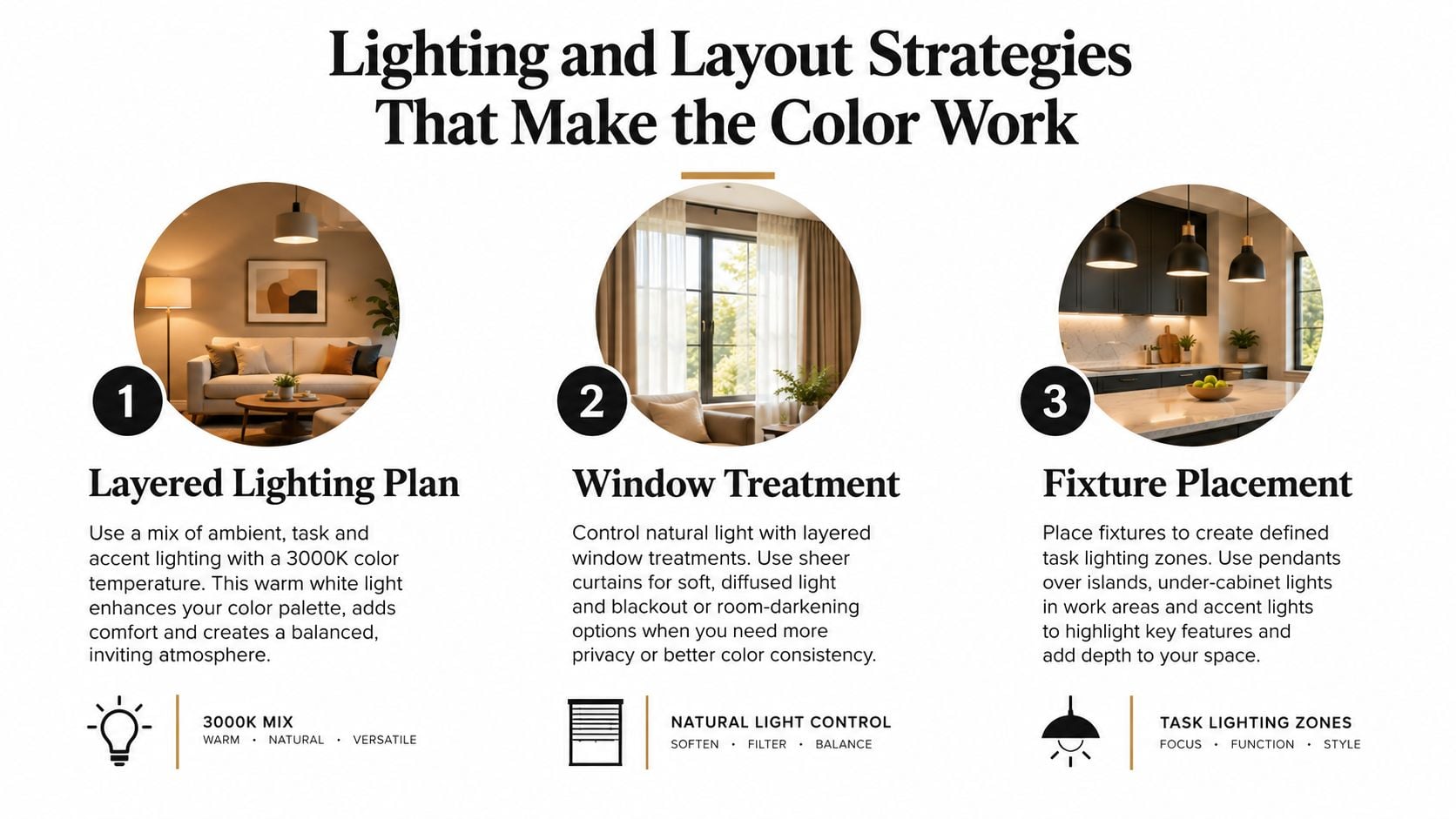
A grey green kitchen can't be specified separately from its lighting plan. South Jersey homes often combine natural light with older ceiling fixtures, recessed lights, and replacement LEDs that don't share the same color temperature. If you approve cabinets before correcting the lighting, you may blame the paint for a problem created by the bulbs.
Use layers rather than one overhead source. Neutral-warm recessed fixtures can provide general illumination without pushing the cabinets too yellow. Under-cabinet linear lighting should be warmer and concentrated over the work surface. A decorative pendant over the island can add another warm layer, provided its light doesn't create a harsh pool that changes the appearance of the cabinet doors.
Avoid overly cool daylight bulbs in grey green kitchens. They can push a muted shade toward blue-green and make white walls feel clinical. Review your sample under the actual fixtures, including the lights you use after sunset.
Let the layout control the color load
Two-tone cabinetry is a reliable way to manage depth. In an open plan, use a deeper eucalyptus on the working perimeter and a lighter sage on the island, or reverse the arrangement if the island needs stronger definition. The distinction should relate to sightlines from the living area, not just the kitchen itself.
In a U-shaped or narrow galley kitchen, covering every cabinet in a dark grey green can make the room feel enclosed. Use the color on the lower cabinets, the island, or a single focal run, then keep the upper cabinetry lighter. If the room has limited daylight, a higher-LRV wall and restrained upper-cabinet color will preserve visual space.
Window treatments should filter light rather than eliminate it. Linen Roman shades and top-down, bottom-up shades let you control glare while keeping enough daylight for accurate color review. They also protect the room from dramatic shifts between direct sun and deep shadow.
Lighting rule: Approve the cabinet sample only after you've reviewed it under morning daylight, evening fixtures, and the light that falls directly on the worktop.
For practical installation planning, discuss dimming, switching, and task zones with a qualified electrician. A specialist who handles motion sensor light installation can also help evaluate where automatic or hands-free lighting makes sense. Finish the lighting plan alongside your cabinet layout, then compare available under-cabinet lighting options before fabrication.
A Cherry Hill Before and After
Consider a 1990s center-hall colonial near Route 70 with original oak cabinetry, a dated laminate counter, and one fluorescent fixture over a peninsula. The homeowners want to preserve the existing plumbing and general footprint, but the kitchen needs a more deliberate color story. Their priority is a room that feels current without depending on a short-lived accent.
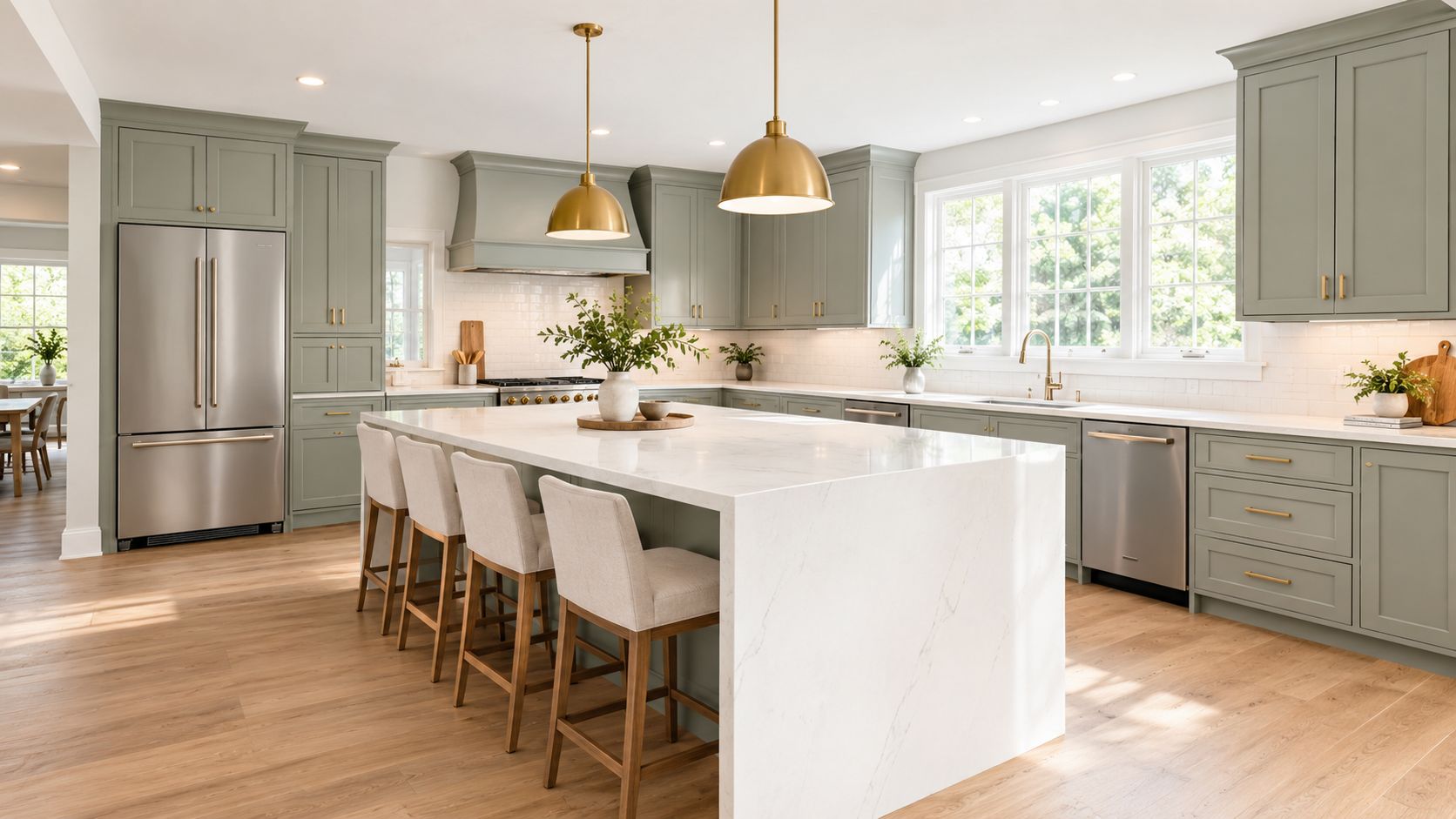
The proposed direction uses Benjamin Moore October Mist on the perimeter cabinetry, Farrow & Ball Treron on the island, and White Dove on the ceiling and trim. Honed Caesarstone Cloudburst Concrete keeps the counter from becoming too bright, while brushed brass pulls add warmth to the sage. Matte black pendants provide contrast without forcing the rest of the room into a black-and-white scheme.
The peninsula is removed in favor of a seating island with cleaner circulation around the work zones. That change matters as much as the paint. A grey green kitchen can still feel awkward if the island blocks the refrigerator, creates a narrow passage, or leaves the primary prep area in shadow.
Why the sample review matters
The cabinet doors should be reviewed inside the home, against the existing floor and the proposed slab. The same door needs to be seen near the window, beneath the upper cabinets, and beside the trim. A mobile showroom workflow makes that comparison practical because the homeowner can review physical doors, hardware, tile, and countertop chips without translating a showroom environment into a different room.
The lighting is rebuilt in layers rather than replaced with another single fixture. Recessed ambient light, warmer under-cabinet task light, and a decorative pendant each have a defined job. That arrangement lets the homeowners judge whether the green remains balanced after dark, when many kitchen decisions are made.
For a visual reference to the completed design direction, watch the accompanying kitchen video after reviewing the material specification.
The lesson is straightforward. Keep the layout disciplined, use one lighter and one deeper green only when the room can support the contrast, and approve the palette with real materials under real lighting. That process prevents a beautiful sample from becoming an accidental mismatch after installation.
Maintenance, Touch-Ups, and Long-Term Performance
Grey green cabinetry is practical, but it isn't maintenance-free. South Jersey kitchens experience humidity, cooking grease, direct sun, and constant contact around pulls, drawers, and the range. The finish system and cabinet substrate matter as much as the color.
Painted MDF offers a smooth base for a consistent color, but exposed edges and damaged areas need prompt attention. Rift white oak introduces grain and variation, which can make a grey green stain or glaze read differently from one door to the next. Laminate veneers are easy to wipe and can provide a consistent appearance, but repairs may be more visible if the surface is chipped.
Use the gentlest cleaning routine that works. A soft cloth and mild, non-abrasive cleaner are usually a better starting point than degreaser used across every surface. Near the range, clean buildup before it hardens. Don't saturate joints, and don't use abrasive pads that can change the sheen.
Choose the finish for the touch points
A satin cabinet finish often hides fingerprints and minor handling better than a very glossy surface. High gloss reflects more light and can make every mark, edge, and unevenness more noticeable. A lower-sheen finish may look calmer, but you should confirm that the coating is suitable for the cabinet material and the manufacturer's care instructions.
For a busy Cherry Hill or Voorhees household, ask whether the doors will receive a factory-applied conversion varnish or another professionally specified coating. Factory finishing can provide more controlled application than a casual brush-on treatment, but the exact system, preparation, curing, and warranty should be documented in writing.
Keep a repair record
Touch-ups are easiest when the original formula and sheen are known. Store a labeled container with the color name, manufacturer, sheen, substrate, and finish system. Keep it somewhere climate-stable, and test any repair on an inconspicuous area before touching a visible door.
If a sale may be near, avoid making the kitchen more personalized than the surrounding home can support. A deep olive across every cabinet, unusual hardware, or an aggressively contrasting island may narrow buyer appeal. A muted sage, mushroom-tinged green-grey, or restrained two-tone palette gives the room character while leaving more flexibility for future furnishings.
Current design coverage points toward warmer, earthier greens, warm neutrals, and texture-rich materials rather than cool gray-heavy schemes. That direction appears in Architectural Digest's kitchen trend coverage, while reporting on kitchen cabinet color trends highlights muted olive, moss, eucalyptus, and two-tone layouts. The durable choice is the one that connects the color to warm wood, practical lighting, and materials you can maintain.
Working With a Mobile Showroom and Next Steps
A small paint chip can't show you how a grey green will behave beside your floor, backsplash, countertop, trim, and existing light. A mobile showroom solves that problem by bringing larger cabinet samples and coordinated materials into the room where the decision will be made.
The visit should begin with the fixed conditions. Tape sample doors beside the existing cabinets, place countertop chips under the doors, and review hardware against both the cabinet and the backsplash. Check the palette from the kitchen entrance, the island, the sink, and the adjoining living area. A color that works at the worktop may look too blue or too dark from the hallway.
A practical in-home workflow
Start with a broad group of sage, eucalyptus, olive, and mushroom-tinged samples. Eliminate colors that fight the floor or become overly cool in the darkest part of the kitchen. Then narrow the field to three shades and compare each one under natural light and the warm and cool fixtures planned for the finished room.
A Marlton galley may end with a light sage on the lower cabinets because the room needs visual openness. A Haddonfield colonial with stronger architectural details may support a mushroom-grey perimeter and a deeper island. Those are design scenarios, not universal formulas. The room's orientation, fixed finishes, and desired cabinet weight should determine the final selection.
Bring hardware, countertop, and tile into the same review. Don't approve the cabinet color first and hope the other materials cooperate later. The strongest palettes usually emerge when the designer removes one competing option, warms one surface, and gives the green a clear supporting role.
Questions homeowners usually ask
Will grey green make my kitchen look dated?
It can if the shade is overly cool, the hardware is too themed, or every surface uses the same gray cast. Muted green paired with warm wood, restrained stone, and appropriate lighting has more staying power.
Does the room need to be bright?
No, but a low-light room needs a carefully chosen lighter shade and a lighting plan that prevents the cabinets from feeling heavy. Test the sample in the darkest corner before approval.
Should I paint every cabinet green?
Not automatically. Lower cabinets, an island, or a single perimeter run may create a better balance in a narrow or enclosed kitchen.
What should I bring to a consultation?
Photographs of the room, flooring samples if available, countertop preferences, appliance information, and a short list of colors you already dislike. Honest exclusions save time.
Start with a video conversation before ordering samples or booking fabrication. You'll reduce the risk of choosing a color that only works in a showroom, and you'll have a clearer material palette before construction decisions begin.
The Cabinet Coach brings cabinetry, countertops, hardware, and tile samples into South Jersey homes so grey green kitchens can be judged against real light and existing finishes. Visit The Cabinet Coach to book a complimentary video consultation and begin with a focused shade and material shortlist.